
Greg is my eldest brother, he is a BAFTA winning illustrator and animator. He has the kindest heart of anyone I know and a prolific talent.
Greg is colour blind and suffers with fantastically bad insomnia… subjects that we cover in this chat.
This was a conversation that was recorded and then transcribed.. I haven’t quite got my podcasting technology perfected yet… but have a cup of tea, and enjoy reading about the world of my big brother.. Greg McLeod.

F: Hello, Gregor. You’re my brother!
G: I am your brother that is correct!
F: I was thinking about you this morning and thinking, ‘I wonder if Gregor has a colour…?’ and I think that you do…
G: Can you guess what it is?
F: It’s blue!
G: Yeah.
F: Yes…you wear a lot of blue.
G: Well, yes I’m colour blind so that features because there are more blues I can use that I understand visually than there are other colours. Purple’s not too far behind but I’m good with brighter purples that do look a bit blue to me.
F: So, explain colourblindness. Let’s rewind a bit. Most people know that colourblindness exists but what can you or can’t you see and also how old were you when you realised this or did someone have to tell you? I’m 8 years younger than you so I don’t know about this.
G: So, what colourblindness is, as I understand it, is it’s like the saturation of the world has been dropped down. So, it’s not necessarily specific colours it’s kind of all colours. It’s like if you turn the saturation down on the telly. If you turn it down by about 20% that’s kind of how I see the world. It’s more muted.
F: So, are there certain colours that you can’t see?
G: I can see all colours. It’s shades that are difficult. So, when I look at a tree, for instance, it tends to look mainly block green- like one green. Whereas, as I understand it, other people see a multitude of greens. I have difficulty seeing some reds as greens some blues as purples, browns into greens and browns into reds. So, I tend to work with very bright colours that are very definitely a colour. Like a definite blue and a definite red and a definite yellow and a definite purple and a definite pink so that to my eyes they are those colours. When it gets into colours that are kind of in between-y like some reds or blues into purple for instance, I don’t know what they are anymore. So, I know they’re still a blue or a purple and I can see how bright or dull they are but I wouldn’t be able to tell you- ‘that’s a blue’.

F: You’re an illustrator…so, has that affected your career. Has it affected the way you work?
G: Ummm, no. I don’t think so.
F: Maybe it’s part of the genius!
G: It’s definitely not genius, it’s mainly hard work. I was never the best at art at school but I did love doing it. I think that I found my own way of colouring things in. The weird things is that 90% of the population would see my work differently to how I see it, which is strange. As I understand it, everyone will see it brighter than I see it which is pretty crazy because I see it quite bright. The only professional error I ever made was actually with you when you asked me to do a golden retriever and I coloured him in light green. And that actually harks back to the first time that I was aware that I was colour blind. I must’ve been 6, I think, and we were asked to colour in a roman soldier- we were given a sheet to colour in – and I coloured his skin in green, it was like a light green, but for me it was pink. And I actually got told off by the teacher for that. So, that was the first time. Because they thought I was taking the mickey you see. But that was the first time I was aware that I had this thing.
I have settings on my computer that I use, particular colour palettes that I’ve created for myself, that I know are good. I tend to use a couple of websites where- if I pick a blue I really like it’ll give you a colour palette that matches that blue and that’s really cool because then I know the colours will then work together because it’s algorithmically worked out with the colours that match. Even though I sometimes don’t know exactly what the colours are I can use them in a palette. So, I can have trees that are really crazy colours but know they all work together.
F: One of the things you did during lockdown which I still think you should turn into a book is ‘Travelling without travelling’…and there they are behind you. Please turn them into a book- I’d buy it! They’re such beautiful pictures and it was such a gorgeous project and they’re watercolours so they’re much more subtle. So, why did you go from crazy colours as you do often in your work for TV to more subtle? Is that because you needed to climb inside them and escape a bit and be gentle?
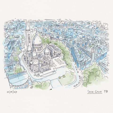

G: I don’t think so. When you’re working on the computer there’s an element of drawing by hand with a pen on a tablet thing and then the colour is very flat and very definite so I’m picking very solid colours. I mean, you can get that manually and I can do it myself but if I’m doing something analogue it’s nice to use a different medium. I’ve always liked watercolours. There’s something very immediate about them. I’ve never really liked acrylics and oils cos they’re quite laborious and actually I can get a very similar effect on the computer whereas with watercolours it’s very hard to mimic digitally. And the thing about watercolours as well is you get happy accidents with the way the water pools. You do get more subtle colours but I have a little watercolour palette within which there are my blues, two greens and a brown, a yellow, an orange, a red and a kind of dark red and then a pink, a purple and a black or a grey actually. And I always use those colours, y’know, there’s no shades.


F: And you’ve done a reference. And you always use that?
G: I don’t use that so much anymore, but it’s there. Because, especially with some of the subtler colours like the purples and the pinks that I don’t use as much, it’s good to have that. I only ever use those colours. I know people have massive wall palettes but that’s just very confusing for me. So, all the postcards. It’s basically postcards of travelling. Or I do portraits as well- people I’d like to go for a coffee with. And they’re nice because they’re just little postcards. They don’t take up too much room and they’re quite cathartic to do. Although I did get to a point with the postcards where I did get quite depressed because I just thought y’know it’s been a long time since I’ve been to any of these places and I won’t be going anytime soon.
F: You also sometimes work in black and white and I often find that when you’re working in black and white it’s a bit of a reflection of your state of mind. You tend to draw in black and white when you seem a bit less…when you’ve got insomnia maybe? I don’t know whether the colour goes out of life a bit when you’ve had bad insomnia…
G: I think maybe partly that. I think it’s also to do with there being a purity to black and white in the same way I love black and white photography where if you take that sort of reality out of the world somehow stuff gets revealed to you in a different way. Also when I’m drawing in black and white I don’t have to think about the colour. Because when I’m working in colour there is an extra layer of me having to really process what colours are working together and so it’s another level of complexity whereas with black and white it’s very simple.
F: That’s fascinating. So for example when I’m looking at my products, the colour thing, when you’re colour blind it is an extra task whereas there’s an immediacy and joy to colour for me. But, for you, there’s obviously another layer of thought which I’ve never really thought about.
G: Yeah, definitely. I mean, my house, I guess it’s kind of Scandi. It’s all painted white. We have natural woods and we don’t have much colour at all. Little spots of colour here and there but I think it’s because on some level I find it confusing cos I’m not quite sure what I’m looking at.
F: Funny… Because when I think about your work, colour is always such a huge part of it and it’s always so distinctive and so beautiful. You made an A-Z poster for my daughter, and it’s in the middle of our kitchen because I love it so much. She obviously knows her ABCs now because she’s 7 but it’s the most joyful piece of art that we have in the house because of the colour and so it is interesting to understand that your relationship with colour is quite complicated yet when I think about you and your art the colour has a real essence of vibrancy and joyfulness … maybe because you have to think about it that much more there’s an investment into it that you possibly don’t see in other pieces of work.
G: Yeah…I wouldn’t say colour is calming for me. I have to engage with it in a very different way. If I was surrounded by colour all the time, if all my walls were a colour I think it would just be….aghhh! So, the environment I have around me is very muted, it’s very monotone. And that’s not because I don’t like colour but I think it’s because if I engage with colour in a creative way for work then maybe in a kind of weird psychological way that too much of it is confusing.
F: Just back to your insomnia. When you have insomnia… does it affect how you work and how you see the world? Because you have insomnia for days and days- I don’t know how you even function!

G: Yeah…I’ve learned how to function, I think. It’s funny looking back over however many years I’ve been doing stuff. I get called prolific so it’s obviously not affected how much work I generate. Has it affected the quality of it at times? Possibly. When it’s really bad- like I’ve done 10 days straight with no more than 2 hours sleep a night- I mean, you can barely do anything at that point and then you really have to go into all kinds of management techniques to get it back together.
F: Do you think part of this is because you are creative? When we were little you were always drawing and I wonder if there’s an element of that?
G: I think I work better when I’m not functioning properly if that makes sense. If I’m super healthy, eating well, sleeping loads and just like really on a level I just feel calm and there’s no dissonance there and I think the insomnia/anxiety things that kick in… I think they all kind of feed that bit of me that has to be creative, to kind of just…if I’m in a bad place then ‘I need to do something good here’, something worthwhile within this and all that spiral of creative tension comes out of that and when I’m calm I find it harder.
F: So, when you did your film, ‘Marfa’, I know you were quite anxious about going to the US and doing that project and so you essentially created a difficult situation for yourself, but you created the most remarkable piece of work. Do you think by creating that slightly difficult environment for yourself that the brilliant piece of work that came out of this was because of that?

G: I think, definitely. The reason that film ended up being what it was is because there were calm moments. The calm moments came when I knew what I was doing. So, when I’m sitting there animating by hand for hours and hours and hours you need a calmness then but the ideas came out of being uncomfortable. The whole situation…I need to make this film, I don’t know what it’s going to be – feeling stressed about that- then the journey was out of my comfort zone and I think the films I’ve done that I’m most proud of came out of something like that…that kind of struggle.
F: Do you read books?
G: Yes and no. I go through phases. Someone made a comment recently: ‘it’s not what you know, it’s what you couldknow’ and I think that’s really profound, especially with all kinds of things at the moment. If you can drill down into a particular thing and really find out about it I think that’s quite a profound thing to be able to do. The problem for me with reading, to a certain extent, is because I’m dyslexic. I love reading but it doesn’t go in and this is a problem I had at school. I could never remember anything. What I do do a lot is listen to certain podcasts and audio books. For instance, if I sit and listen to an audiobook and do a painting or a drawing I can recall that book by looking at the picture I made.
F: To our childhood…I’m interested to know if you think about our childhood, where we lived; is there a specific colour that stands out to you? Because there really is for me. But I don’t know if that’s because I’m younger?
G: Weirdly, around cars. Because Mum had a green MG, like a pea green, and I actually ended up having a pea green mini at some point and then Grandpa had a yellow opal manta.
F: Oh my goodness, that car was awesome! Do you remember if you sat on the backseat you just used to slide across when Grandpa turned the corners really fast! No seatbelts in that car in the 70s!
G: Absolutely. He never used the gear…he used to go from second to fourth.. It was a brilliant car.
I think Dad had a white Triumph stag and a white Jag…so I remember the colours of cars. I grew up in the 1970s in a cul-de-sac in middle England and it was very brown. Lots of browns and beiges.
F: For me the colour is red because of that red carpet we had in Ladywood road.
G: …I know why it’s red! Do you remember that red outfit I had?
G: So, we went to Portugal on holiday and I bought a pair of red jeans which had buckles across the crotch, a red shirt and a white leather tie!
F: Oh yes! Truly stylish 70s ensemble.
G: And I seriously wore that for about a year and I thought that I looked cool. I think I probably traumatised you as a child walking round like that. And walking around dressed like that on that red carpet would’ve looked quite something!
Greg currently has a children’s show on C5 Milkshake called Circle Square that he created with my other brother Myles McLeod.

You can follow his mind wanderings here… he’s currently working on a chicken study..!
https://www.instagram.com/myinkyhead/